


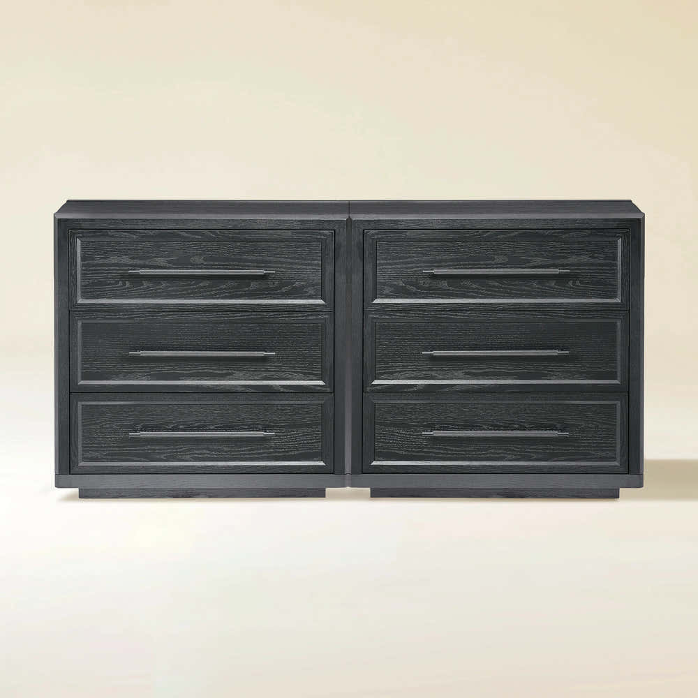
Alvar 61″ Oak 6-Drawer Chest(Set of 2)

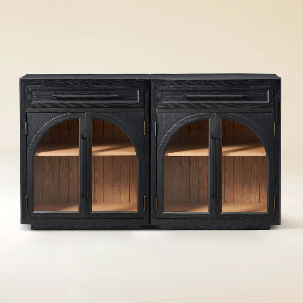
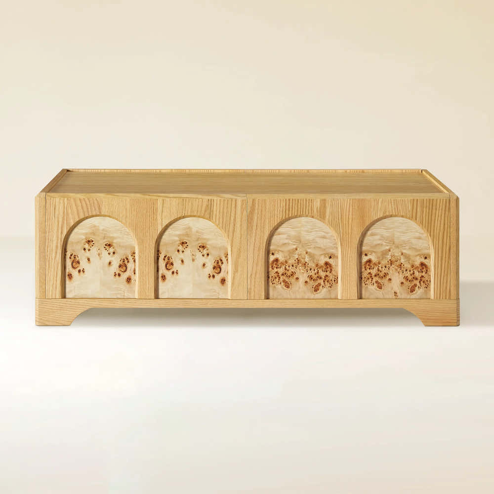
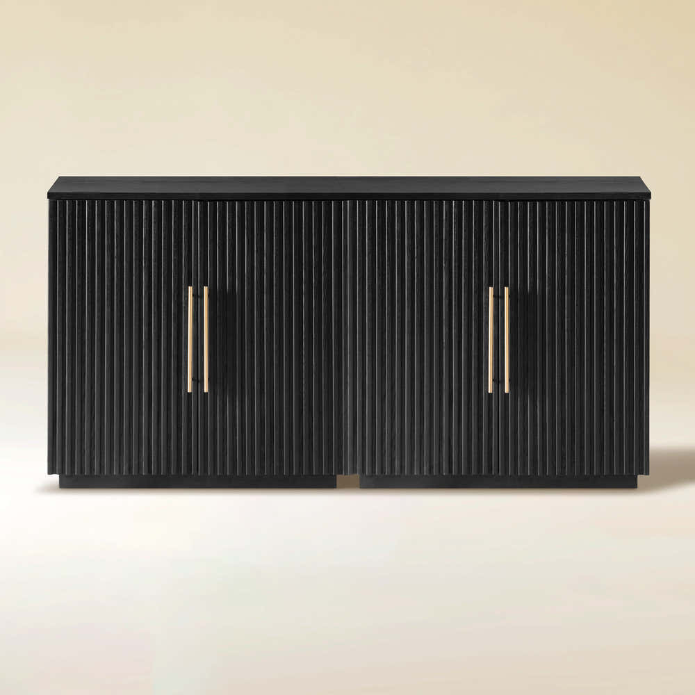
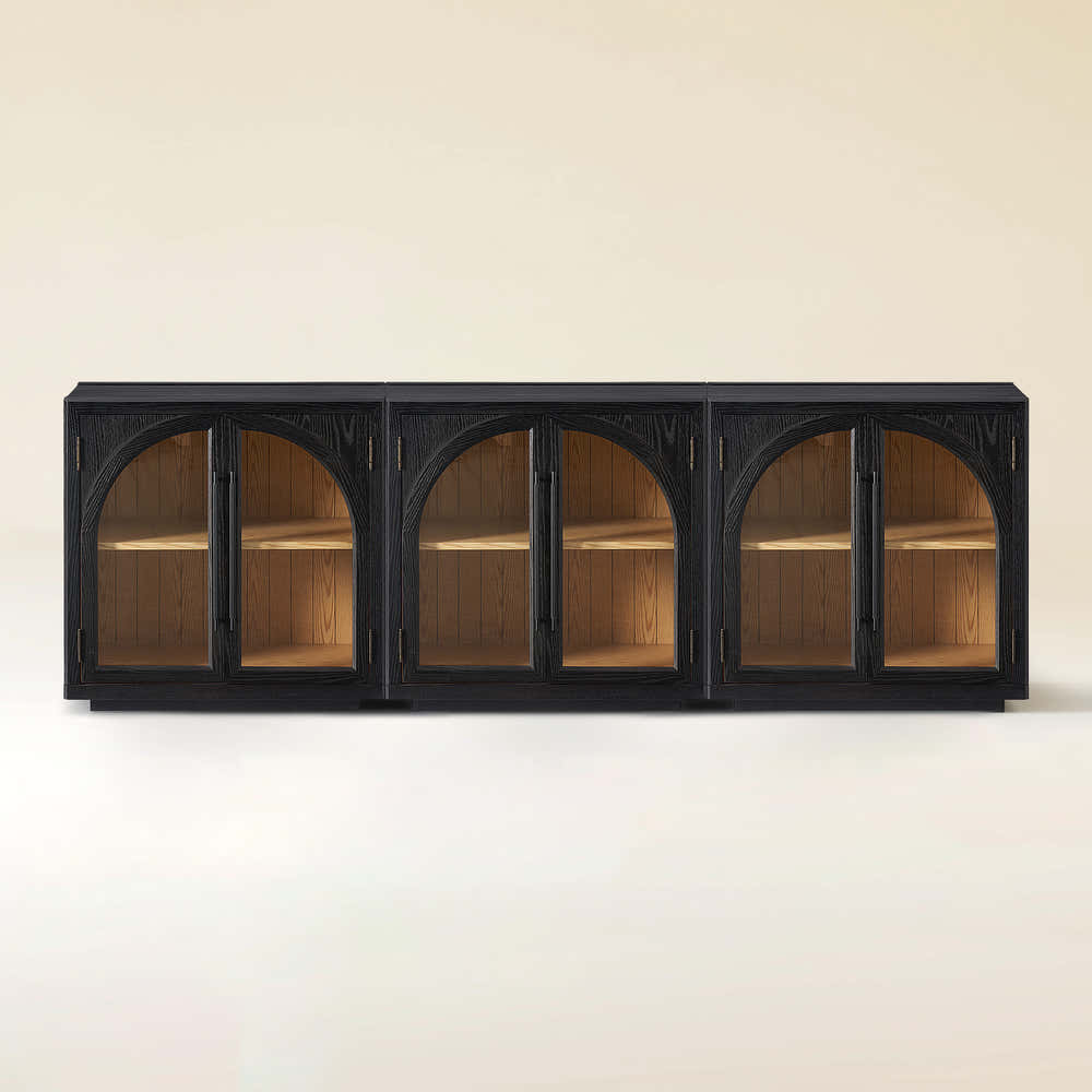
Alvar Arched 61" Oak Sideboard with Drawers(Set of 2)
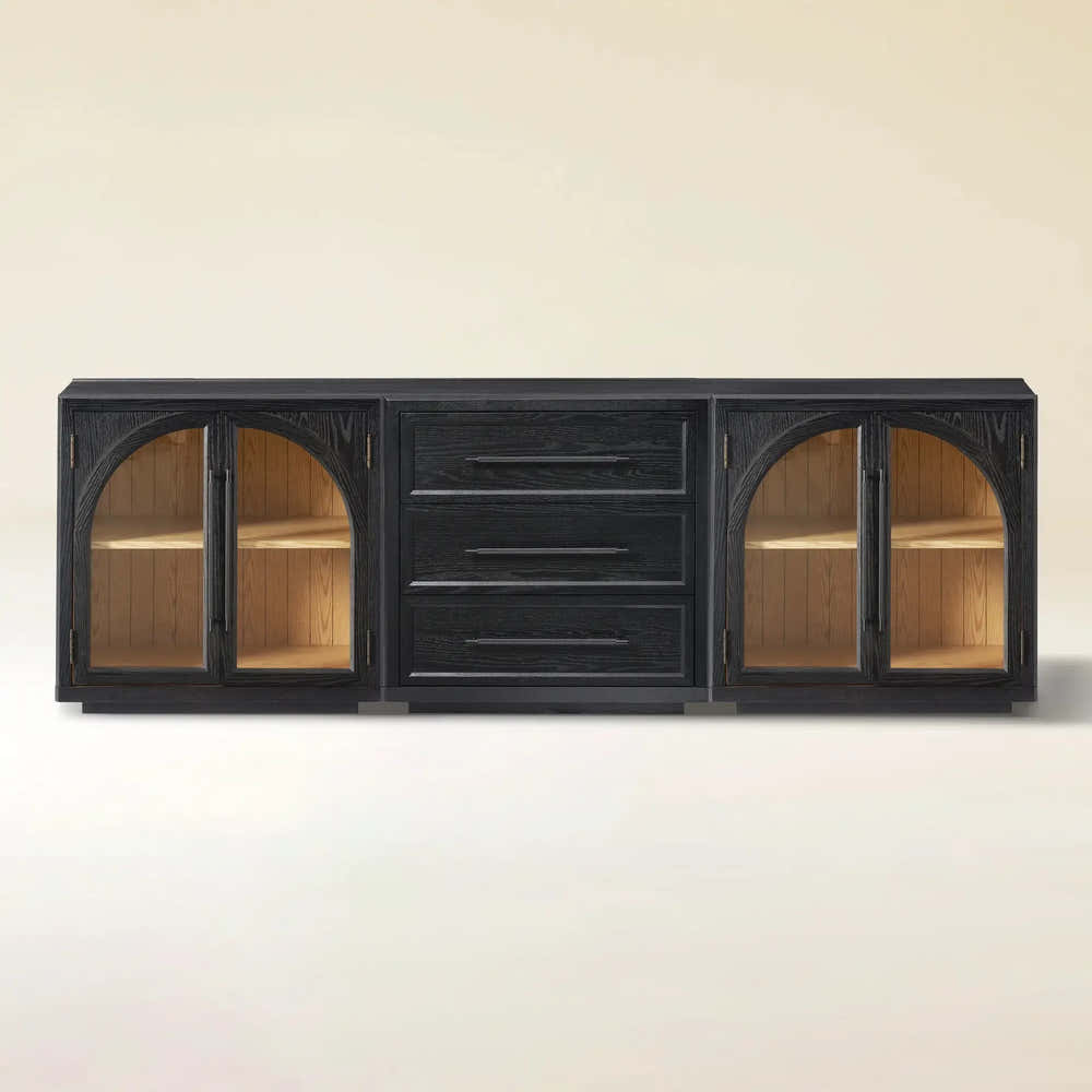
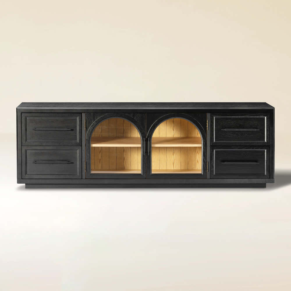
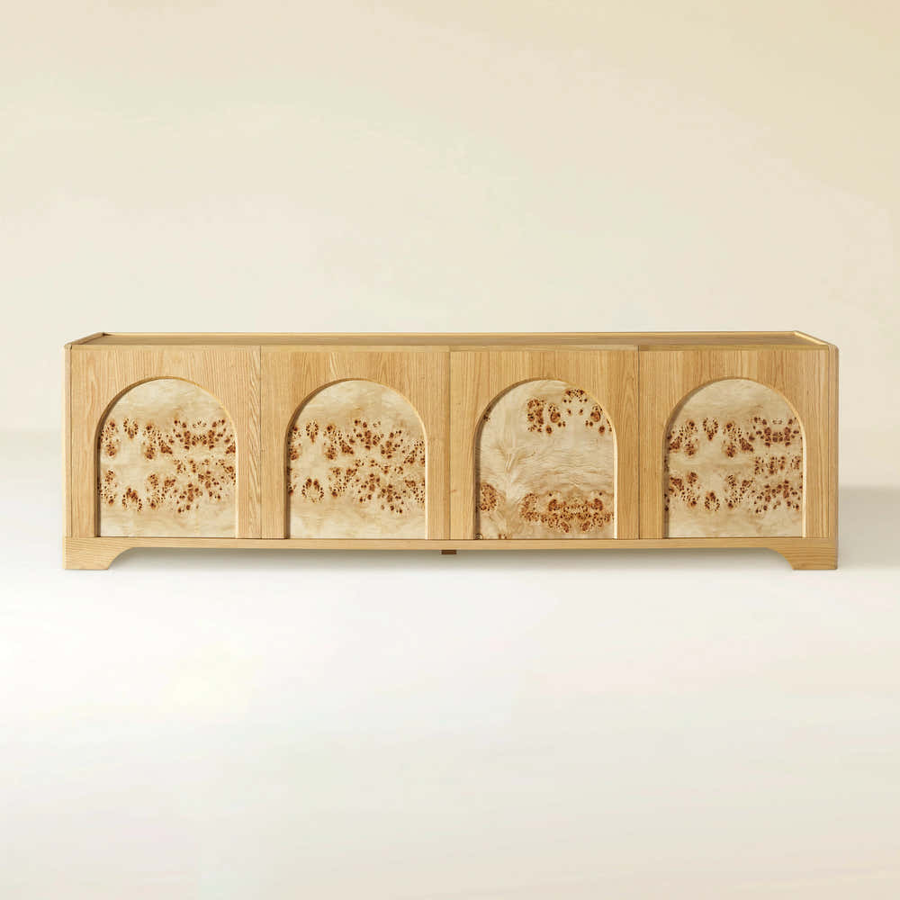
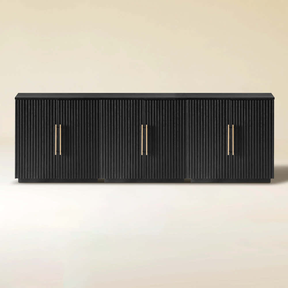
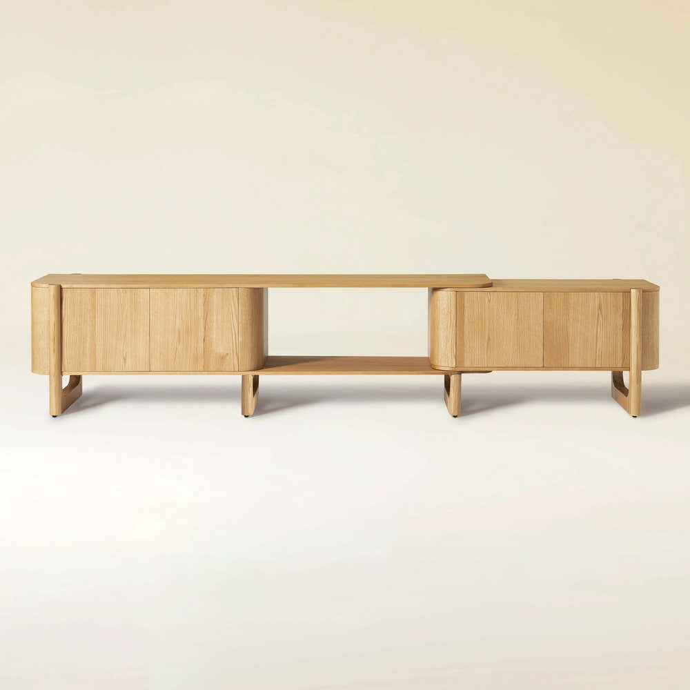
Alvar Arched 94.5″ Oak Modular Media Console(Set of 3)
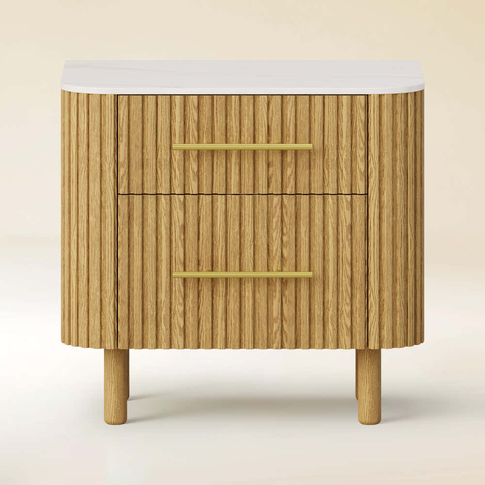
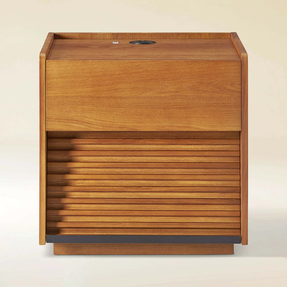
Charlie Sintered Stone Nightstand 26" W

Ewan Sintered Stone Nightstand 26"W
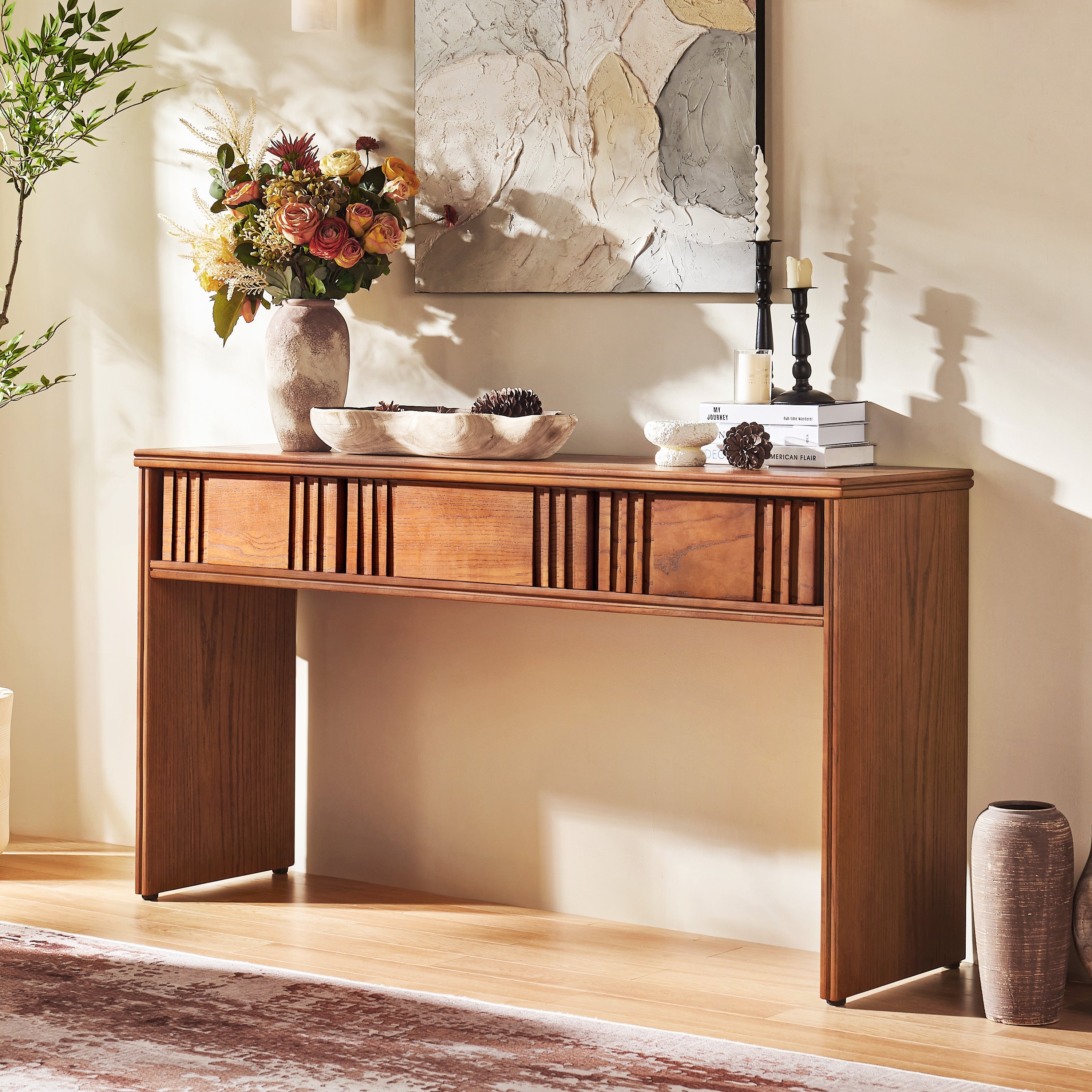
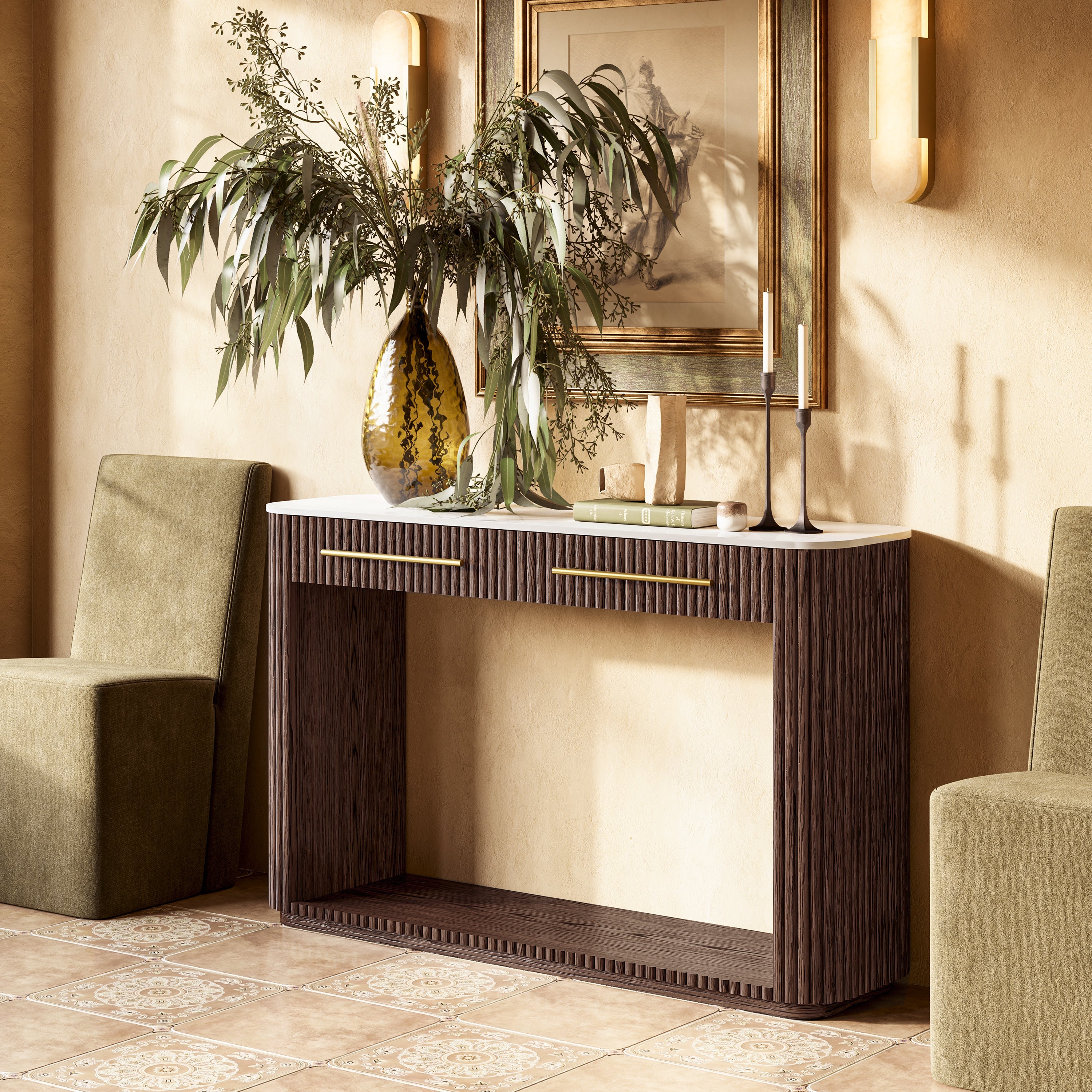
Holt 63″ Solid Oak Console(Set of 2)
Holt 95″ Solid Oak Console(Set of 3)
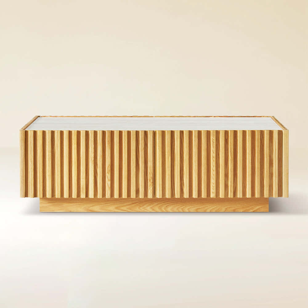
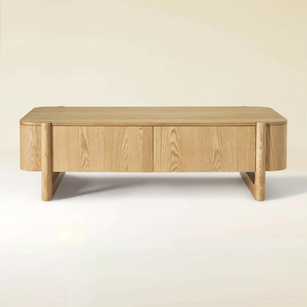
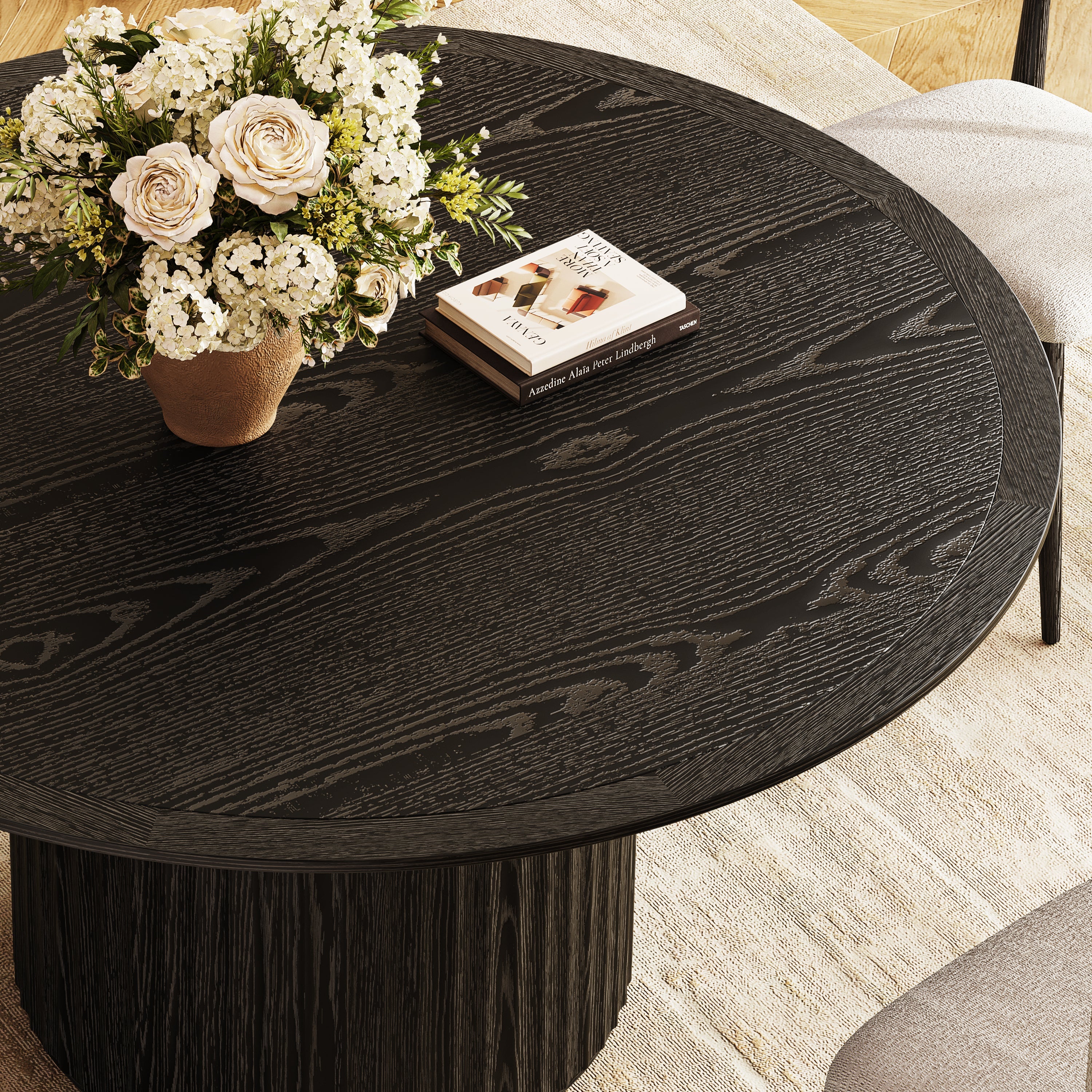
Isla Oak Sintered Stone Rectangle Coffee Table 120cm
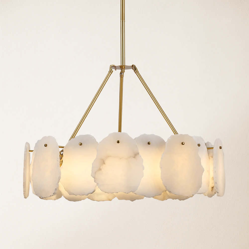
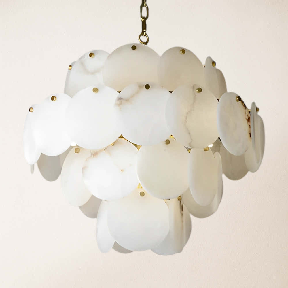
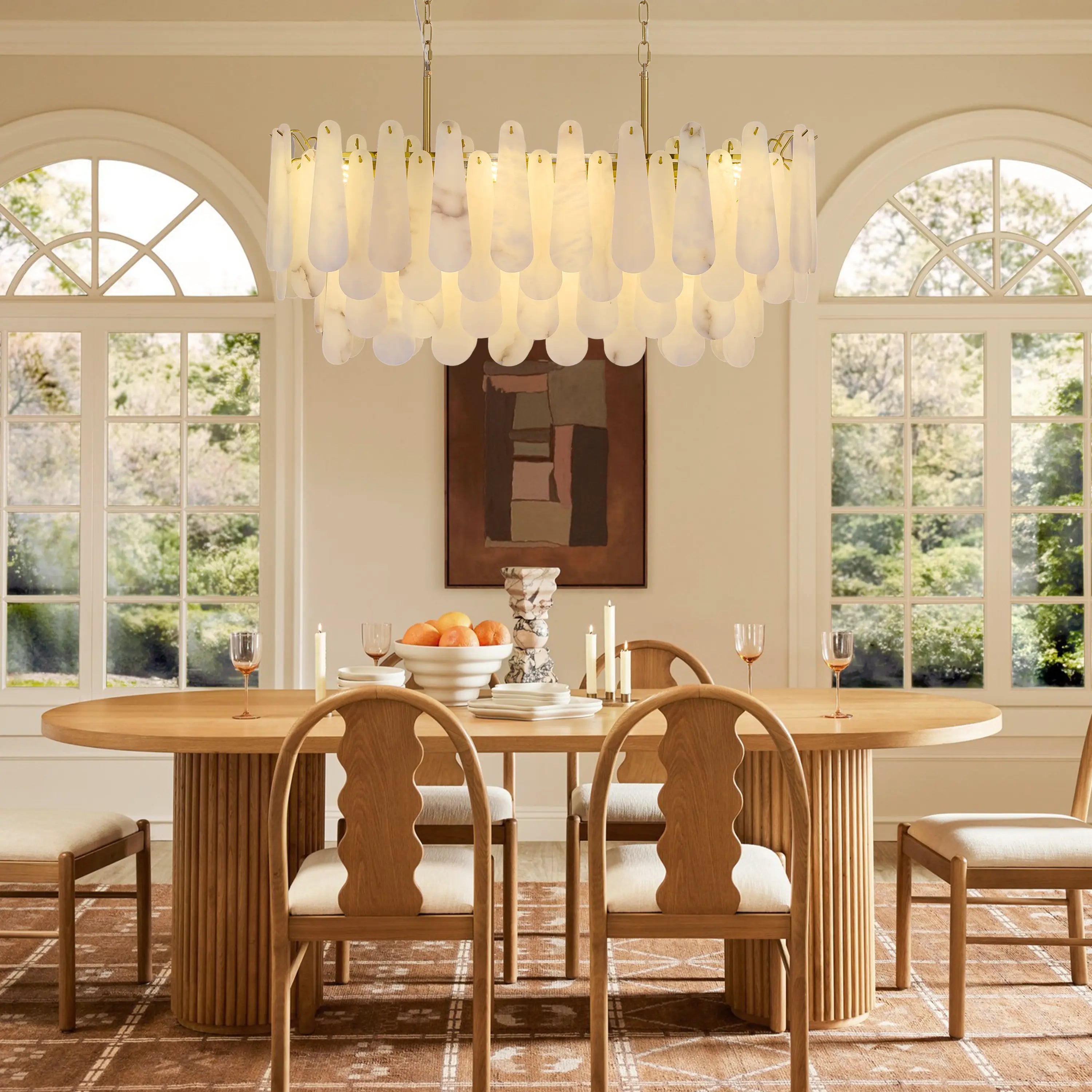
Moira Alabaster Round Chandelier 24"D


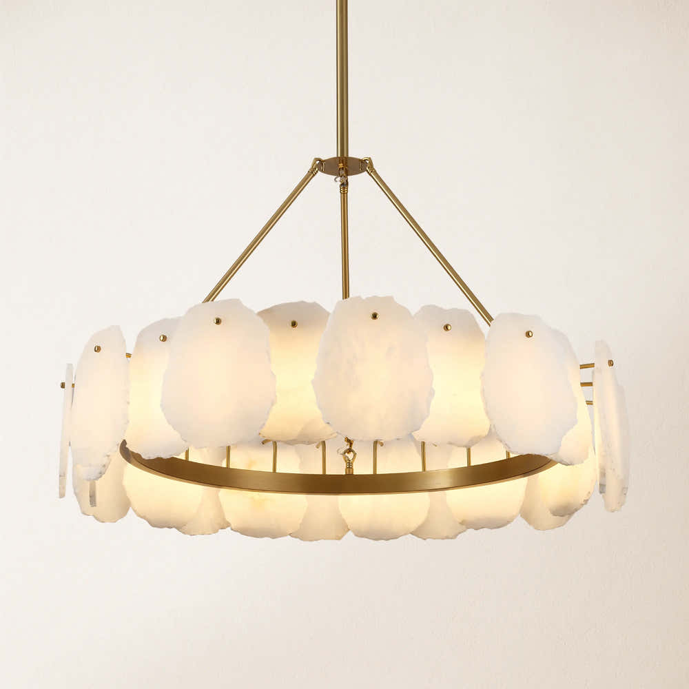
Moira Alabaster Round Chandelier 32"D
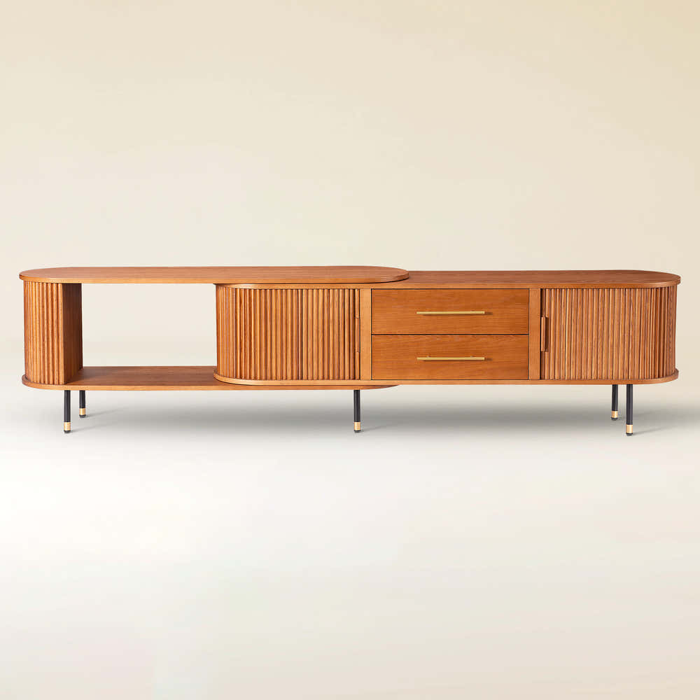
Silas Extendable TV Stand 203cm to 280cm
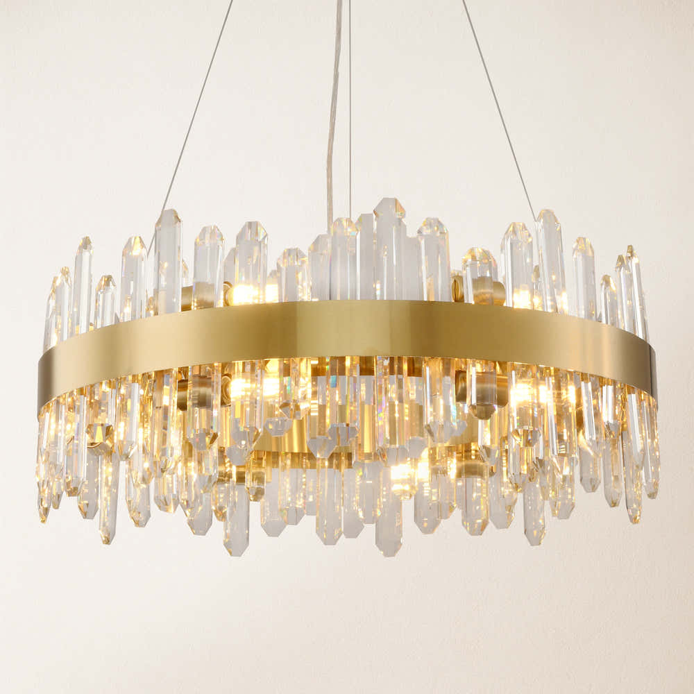
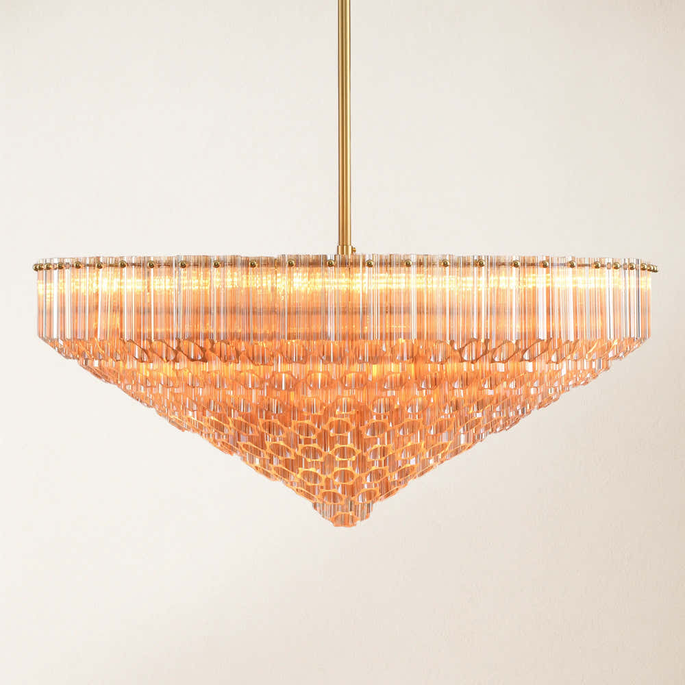
Stellara Crystal Strip Round Chandelier 24"D
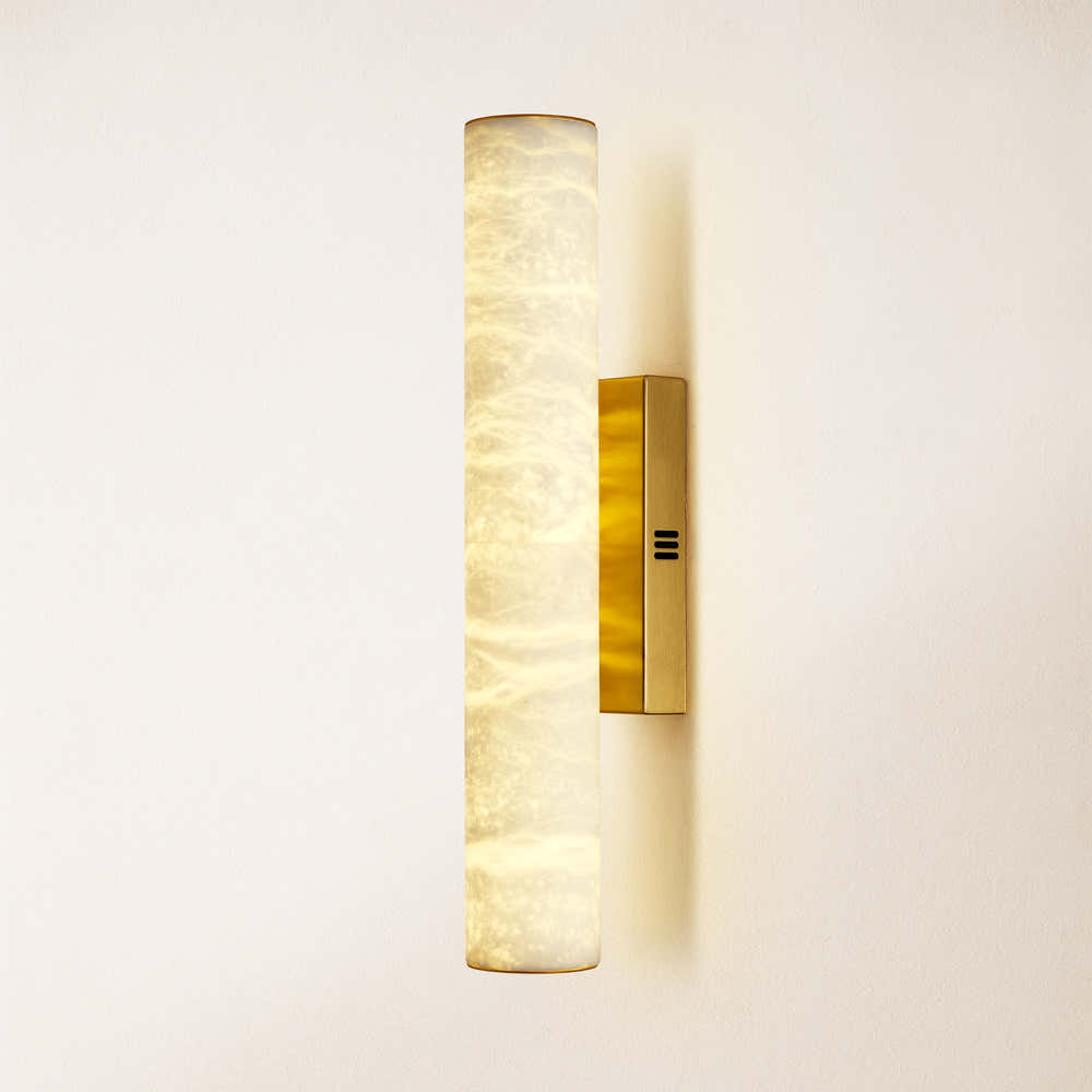
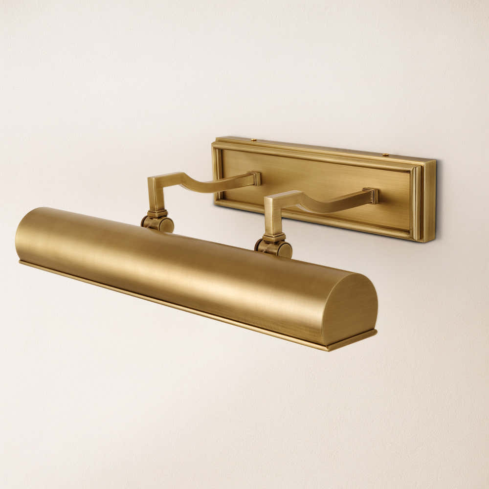
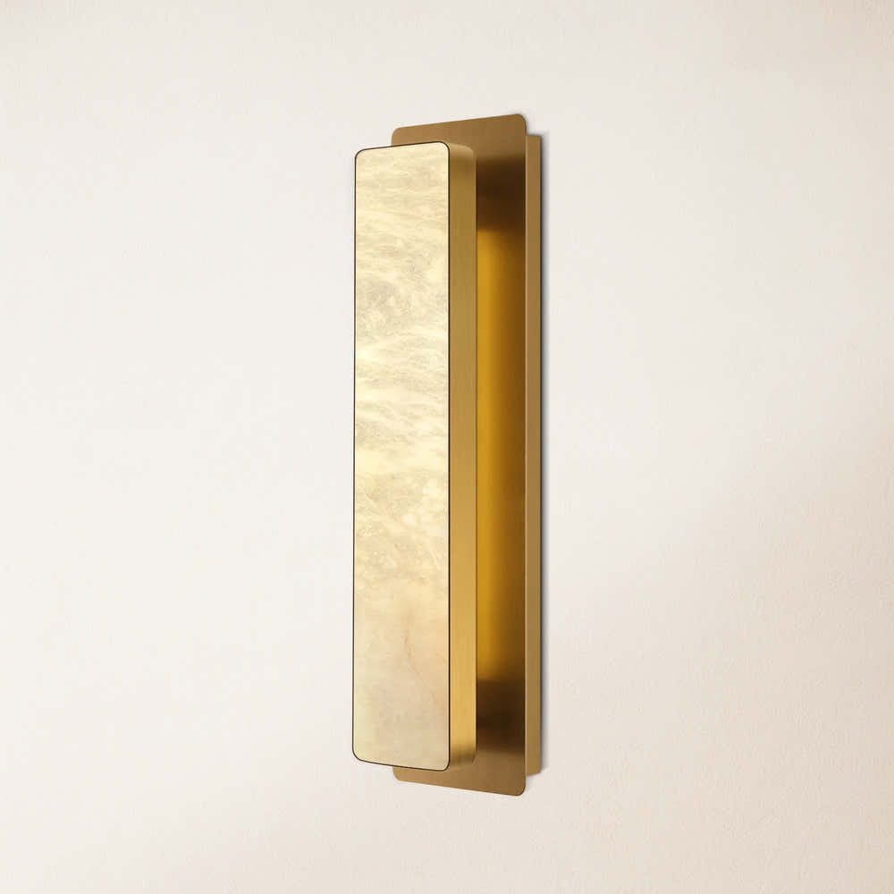
Sylvia Palladian Alabaster Wall Sconce 20"H
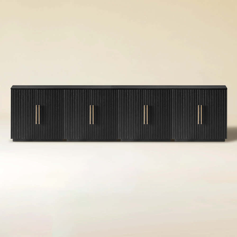
Alvar Arched 95″ Oak Media Console(Set of 3)
Ewan Oak Extendable Media Console 79" to 110"
Holt 126″ Solid Oak Console(Set of 4)
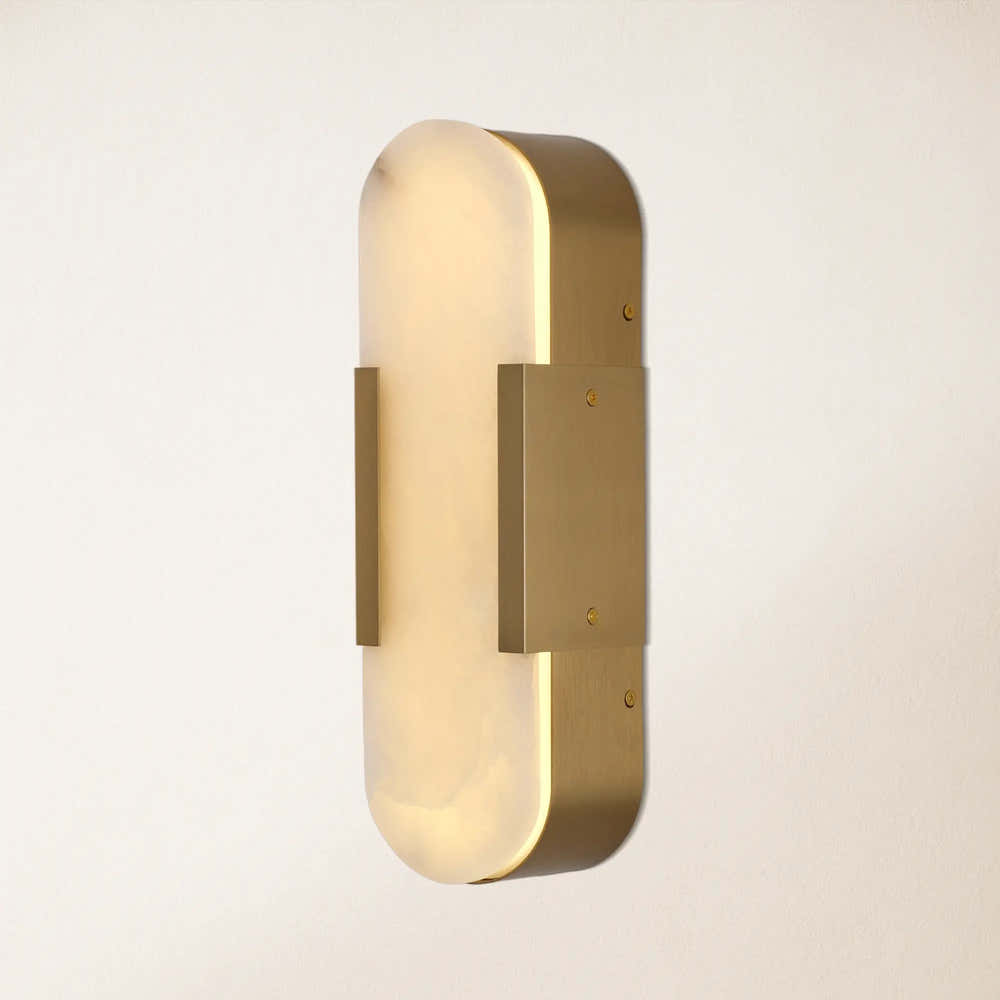
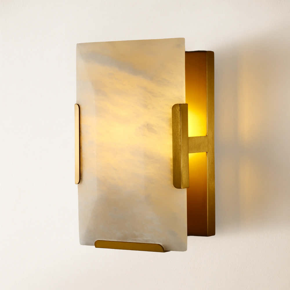
OpalEdge Alabaster Wall Sconce 14"H

FSC FCOC47059 . FSC is dedicated to the promotion of responsible forest management
worldwide. By selecting this product, you help take care of the woorld's forests

UL-certified for indoor drying environments not directly exposed to excessive moisture or water;
Use in the United States and Canada.

Certified to Dry ETL electrical standard: suitable for use indoors in dry locations not directly exposed to excessive moisture and water
Use in the United States

CE-certified drying equipment compliant with electrical standards: Suitable for indoor drying environments not directly exposed to excessive moisture or water;
Tested for use in Europe, the UK, and other regions.


The support center has answers to questions you may have. You can also contact customer service in the support center if you can't find what you're looking for.
Support Center >
At houlte, we are committed to delivering quality, style, and great value to our customers. Our goal is to simplify your shopping experience by providing competitive prices and exceptional service.

If an item you purchased from houlte goes on sale on our website within 30 days of your purchase date, you may request a price match. This policy ensures you always receive the best value when shopping with us.
Houlte reserves the right to interpret and adjust the terms of the Price Match Policy as necessary.
Houlte has partnered with Taskrabbit to make your everyday life at home easier by connecting you with flexible and affordable ways to get your to-do’s done including furniture assembly and mounting.

1. Purchase your furniture at Houlte.
2. Check your order Dispatched and Delivered email and click the
Houlte link. You will be redirected to Taskrabbit's landing page.
3. Post your task on Taskrabbit platform.
4. Pick the best tasker to assemble your furniture.
Houlte has partnered with Taskrabbit to make your everyday life at home easier by connecting you with flexible and affordable ways to get your to-do’s done including furniture assembly and mounting.
Taskrabbit Assembly is available in most metro areas in the US. The availability of Taskers varies based on demand. When placing an order on Taskrabbit, you will need to enter your zip code. If the service is not supported in your area, you will not be able to place an order.
You can book assembly for your Houlte furniture as early as the next day after your delivery, and up to 14 days in advance, giving you flexibility to choose a time that works best for you.

Ready to use out of the box; minimal installation may be required (e.g., handles).

Main structure is pre-built; minor components require attachment (e.g., legs).

Assembly required; multiple parts must be assembled before use.
Our furniture is built with a combination of core boards, real wood veneers, and selected solid wood parts. Each material is used for a different purpose—structure, surface appearance, or visible strength—so the final piece feels balanced in performance, finish, and cost.
Core boards form the internal foundation of the furniture. They provide structure, stability, and efficiency across large surfaces and cabinet bodies.

Stable structural board

Smooth and consistent

Functional internal board
Selected solid wood parts are used where visible strength, tactile quality, and structural integrity matter most—such as legs, frames, trim, and exposed support details.

Durable and classic

Light and versatile

Premium and elevated
A dark wood bed already does a lot of work in a bedroom. It brings gravity, warmth, and a kind of built-in structure that lighter bed frames often do not. That is why choosing the right nightstand color is less about "matching" and more about deciding what role you want the bedside pieces to play.
Do you want them to soften the room?
Brighten it?
Echo the bed?
Break it up with contrast?
At Houlte, we usually approach dark wood beds as a strong visual anchor. Once that anchor is in place, the best nightstand color is the one that creates balance around it—not competition, and not bland repetition either. Below, we are sharing the color directions we think work especially well, plus a few styling cues for making the pairing feel considered rather than accidental.
When a bed is dark wood—walnut, espresso, dark oak, mocha, or coffee-toned veneer—the nightstand should usually do one of three things:
What tends not to work as well is choosing a bedside color that is close to the bed color but not quite right. Near-matches often feel more awkward than either a true match or an intentional contrast.
Soft gray is one of the easiest ways to modernize a dark wood bed without draining warmth from the room. It lightens the bedside area without going stark, feels calmer than pure white, plays well with black accents and brushed metals, and helps dark wood feel more architectural and less heavy.
We especially like soft gray in bedrooms with charcoal or taupe bedding, greige walls, matte black lighting, and layered linen textures. The key is to keep the gray warm enough to relate to the wood. A cold, blue-based gray can make a dark bed feel harsher. A stone gray, mushroom gray, or warm ash gray tends to be more forgiving.
White is the cleanest contrast you can put next to a dark wood bed. It creates separation instantly and makes the bed frame stand out. It works best when the room needs visual lift, you want a fresher brighter bedroom, the bedding palette is neutral and airy, or the bed itself is visually heavy and needs relief nearby.
That said, not every white is the same. We usually favor creamy white, alabaster, warm off-white, and stone-white tones. Those shades keep the contrast crisp without making the room feel clinical.
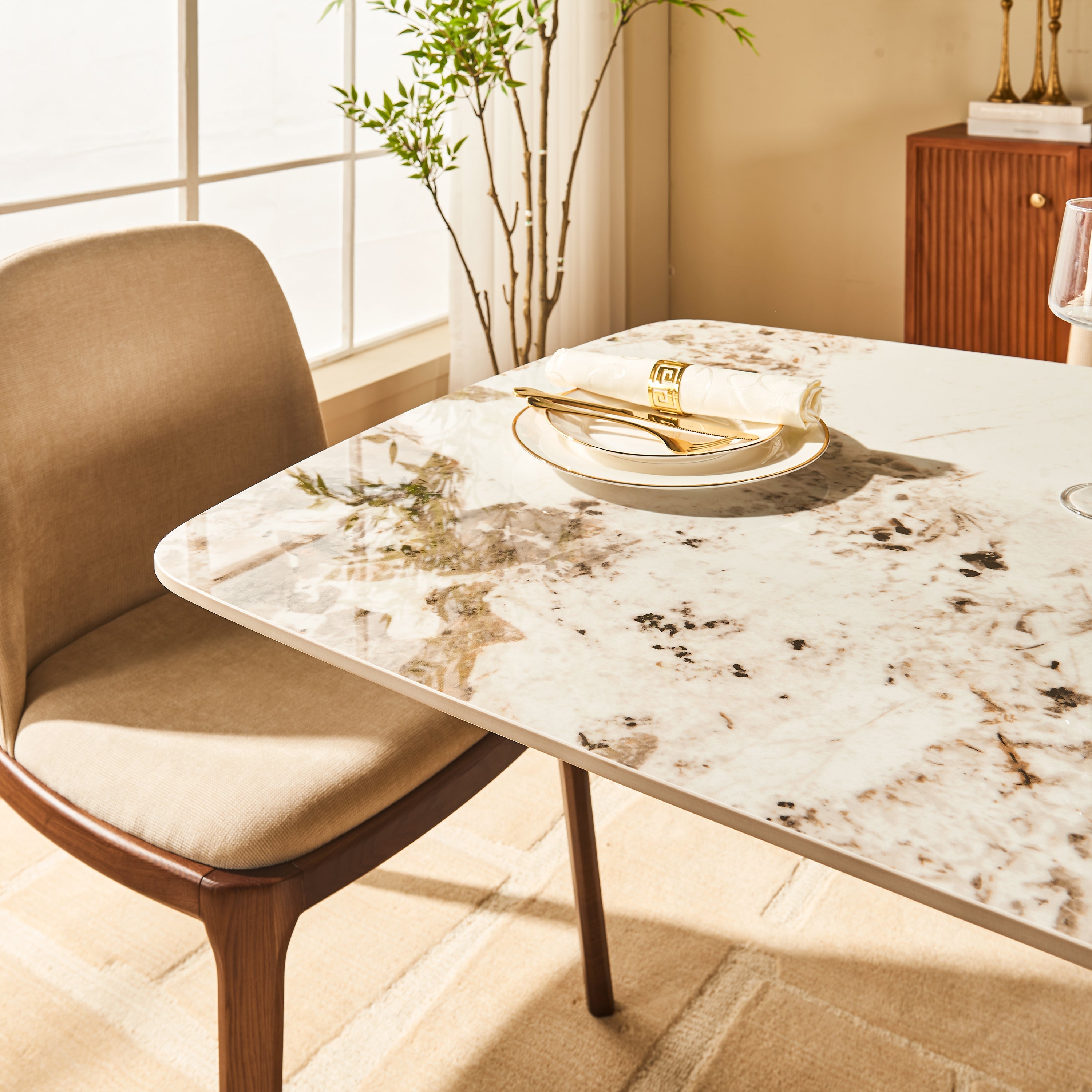
If you want a lighter bedside look but still want material richness, a piece with a stone or sintered-stone top can often bridge the gap beautifully.

The stone element helps brighten the palette while the oak structure keeps the pairing from feeling too cold next to a dark wood bed.
View product →Earthy green is one of our favorite directions with dark wood because it adds depth without fighting the warmth already in the room. Against dark wood, earthy green often creates a room that feels layered, moody, and quietly current.
We see this palette working especially well with brass or antique bronze details, textured neutrals, warm white bedding, natural woven elements, and plaster, linen, and matte ceramics. If you are not choosing a green nightstand itself, you can still build this color relationship through accessories, art, a lamp base, or wallpaper behind the bed.
This phrase matters less as a literal furniture material and more as a mood reference. "Velvet-textured neutrals" suggests colors that feel soft, dimensional, and slightly enveloping rather than flat. These shades pair beautifully with dark wood because they soften its weight while preserving richness. They do not snap against the bed the way white does; they cushion it.
If the room is aiming for a more cocooning atmosphere, these are often the colors we trust most.
A nightstand does not need a bright color to stand out. In fact, with a dark wood bed, contrast often works better through finish, silhouette, or texture than through dramatic color alone.
When the bed is visually dense, even a subtle color difference can have impact if the form is strong.

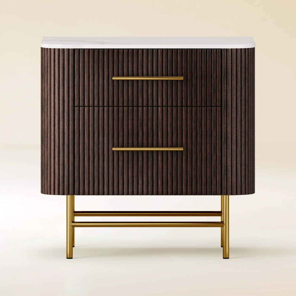
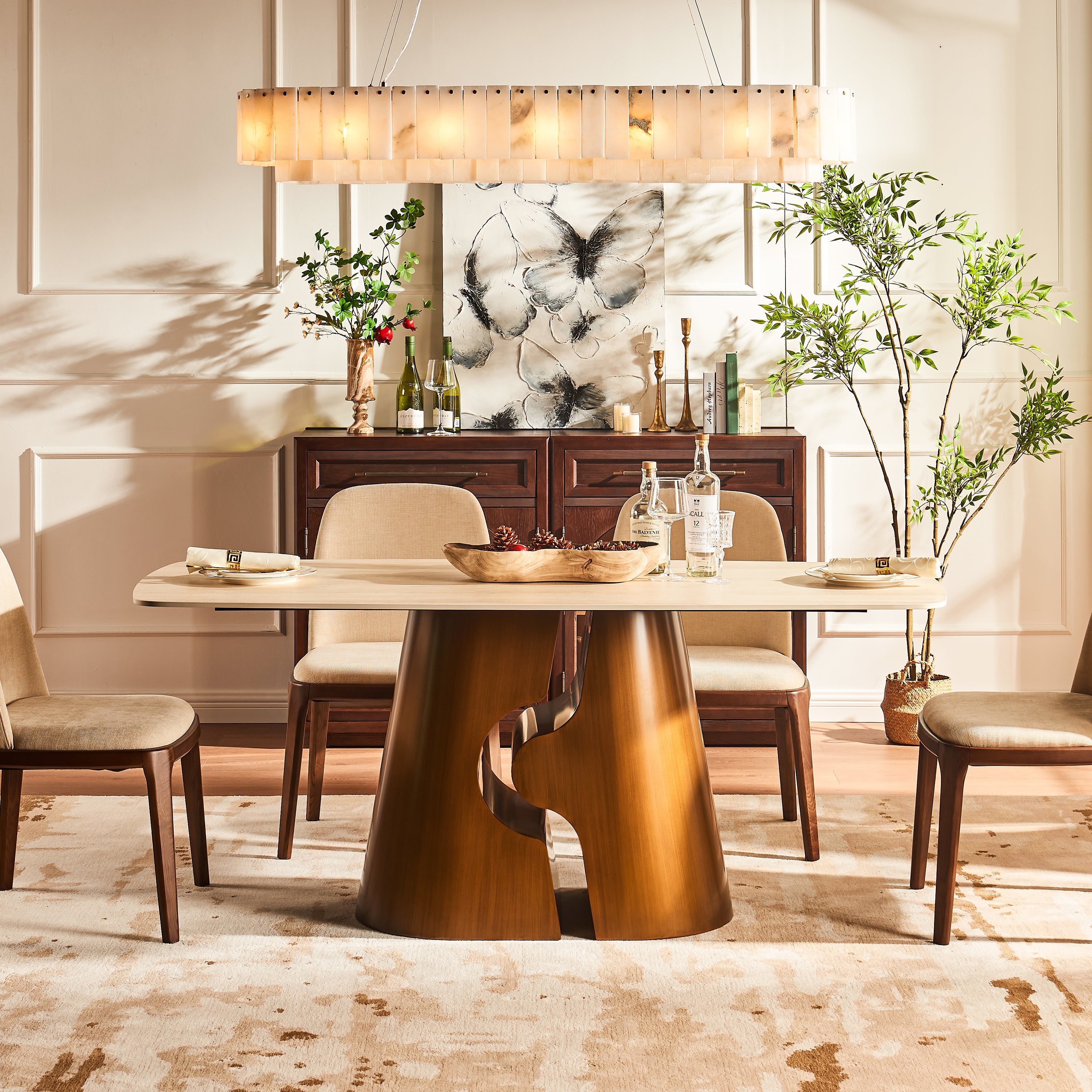
Its mocha-brown finish and stone top sit comfortably beside a dark wood bed while adding variation through texture and surface contrast rather than a sharp color break.
View product →A dark wood bed does not have to be paired with a same-style nightstand. In fact, mixing styles often gives the room more life. A few combinations we like:
The trick is to keep some point of connection: similar undertones, repeated curves or lines, matching hardware family, or related scale. Style contrast feels interesting when tone and proportion stay under control.
When we are helping narrow down bedside color choices for a dark wood bed, we usually ask three things:
Those questions usually reveal the right palette faster than trying to memorize design rules. If the goal is brightness, look to warm whites, pale stone, and gentle grays. If the goal is depth, choose mocha, olive, taupe, or layered brown neutrals. If the goal is balance, look for mixed-material pieces that bring both warmth and lift.
Browse all nightstands →Yes—often a very good one. Vintage or vintage-inspired nightstands can work beautifully with dark wood beds because they tend to introduce shape, patina, or detailing that prevents the room from feeling too flat or too "set-like." We especially like vintage-leaning bedside choices when the bed is simple and heavy, the room needs softness, you want a collected look instead of a showroom match, or the palette is already grounded in warm tones. A vintage nightstand does not have to match the wood exactly. In many cases, a difference in finish is what gives the room character.
When making the final choice, we would weigh these in order:
The best bedrooms rarely rely on one-note matching. What makes a room feel elevated is usually a little more nuanced: a bed with presence, nightstands with purpose, and a palette that feels layered rather than formulaic.
With a dark wood bed, some of the most successful nightstand choices are not the most obvious ones. A soft gray can sharpen the room. A warm white can lift it. A mossy green can deepen it. A taupe or velvet-like neutral can quiet it in the best way.
That is the part we find most interesting: dark wood is not limiting. It is actually one of the easiest starting points for building contrast and texture well.
Sometimes that means contrast. Sometimes it means tonal depth. Sometimes it means a lighter surface or a softer neutral that gives the room room to breathe.
The best pairing is the one that makes the bed feel intentional—never isolated, never overmatched, and never too heavy for the space around it.
Share:
Do Nightstands Have to Match? Exploring Your Options
What Size Rug for a Dining Room? A Complete Guide for Modern Homes